Over the past few months we have been working to incorporate new improvements into our APP to make your experience increasingly better.
These updates relate to:
- Performance,
- program planning,
- session planning,
- the platform’s appearance,
- and its usability across different screen formats.
In this post you can consult in detail what each one is about and how they will make your day-to-day use of NeuronUP easier.
Performance improvements
First of all, we have been working to make the platform run much more smoothly.
Improvements in program planning
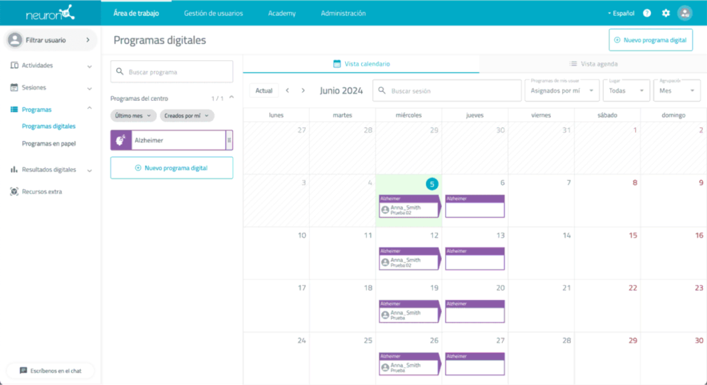
A new mode to organize each program’s sessions has been implemented.
Thanks to this new design, it has become easier and more intuitive to display the sessions that belong to each program.
Starting with Right Now, programs will appear in the calendar as follows:
Improvements in session planning
Regarding sessions, we have a few more updates for you:
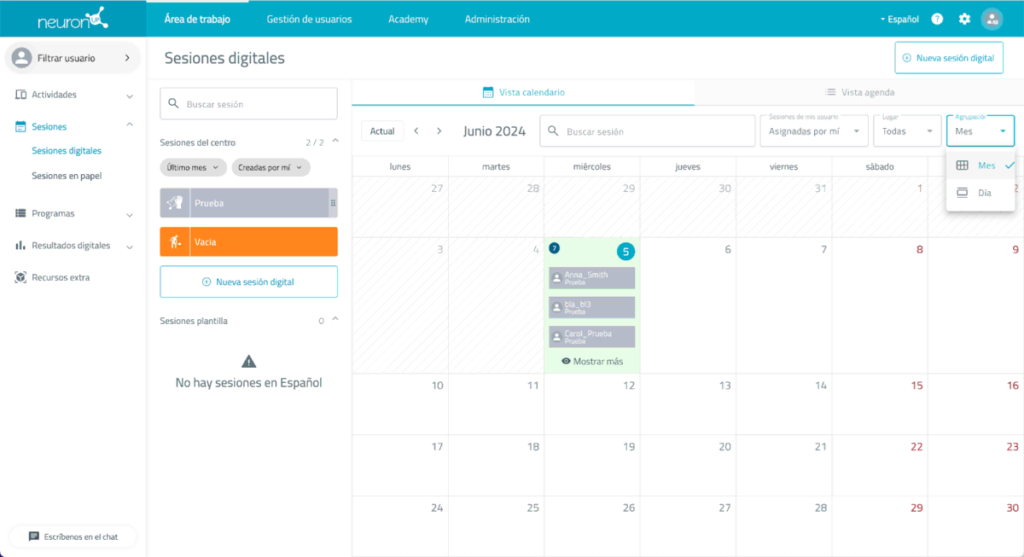
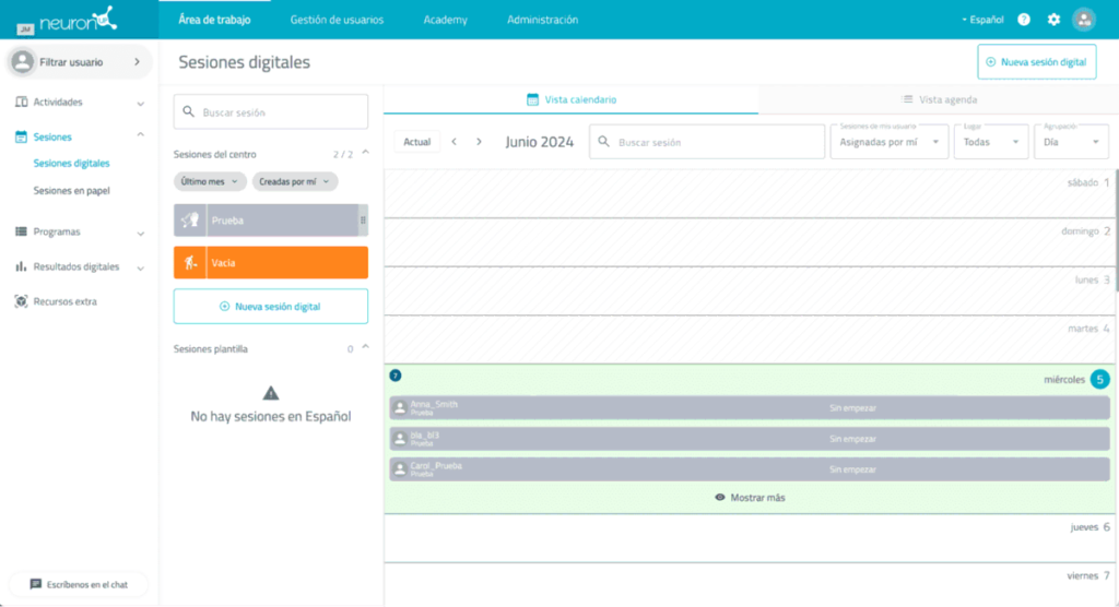
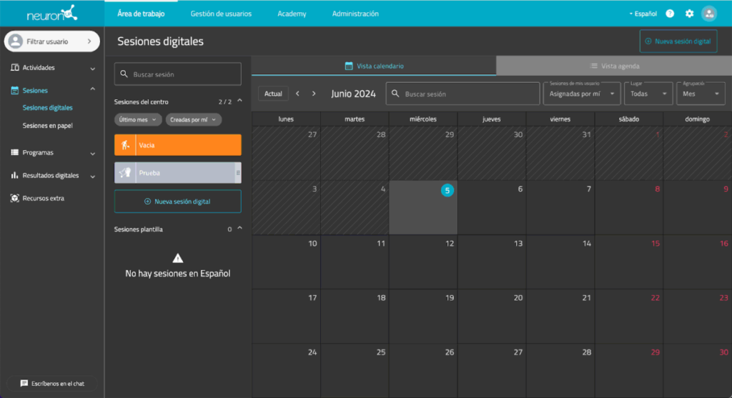
1. Calendar redesign
1. Fit to screen
First, the calendar has been redesigned to fit perfectly to each screen, regardless of its size.
2. Information per day-cell
We have also modified the information shown in each day-cell. From Right Now, a maximum of three sessions will appear in each cell, with the option to expand details using the ‘Show more’ option.
Likewise, a session counter has been added to each day-cell. The idea is that each professional can more quickly determine the sessions scheduled for each day at a glance.
2. New day view
In addition, we have enabled a new configuration so you can view the calendar by day.
This new option joins the traditional ability to view the session calendar by month.
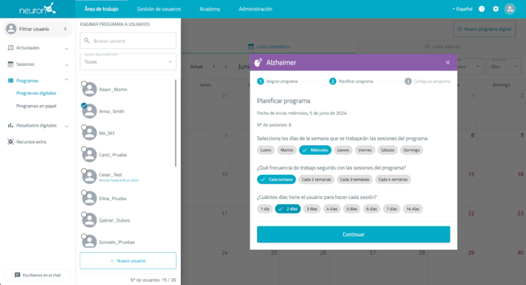
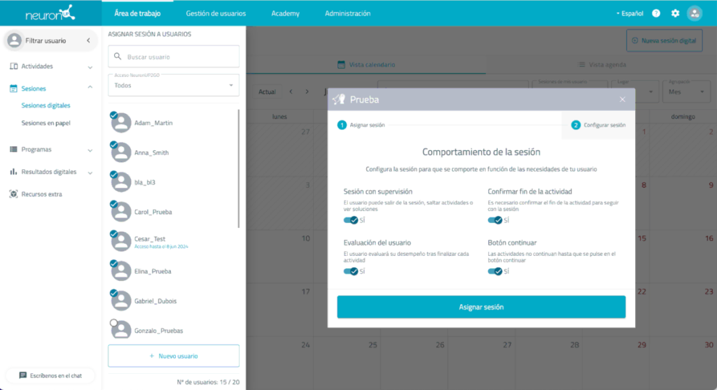
3. Sessions with supervision
1. Supervised sessions in the session configuration
We have also included the supervised session behavior parameter in the session configuration pop-up panel to make it easier for you to select it.
The option is available in the second step of the process, as you can see in the following image, and it allows granting or removing control from the user:
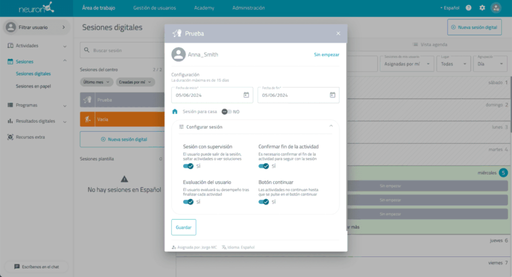
2. Supervised sessions in the calendar
In line with the improvement described above, the session pop-up panel in the calendar has also been restructured to include this supervised sessions parameter.
Improvements in the platform’s appearance
1. Reading-related improvements
1. Sizes, typefaces and colors
The sizes of the elements appearing in each section of the platform have been modified, as well as their respective typographic settings and colors. Right Now they have better contrast.
2. Chat
We have also changed the location of the chat shortcut.
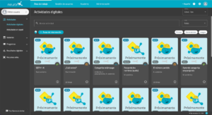
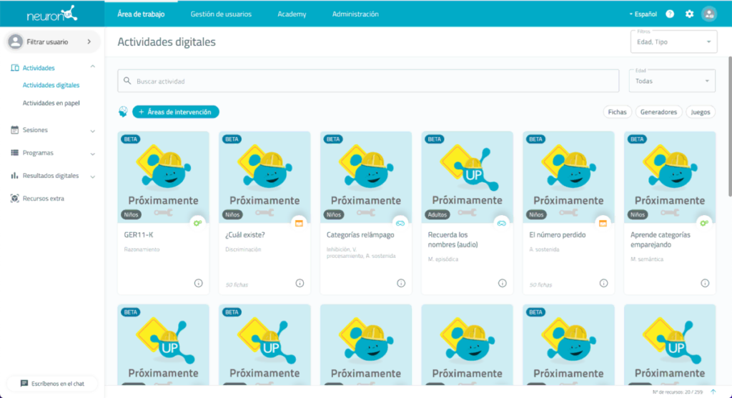
From Right Now, instead of being located in the lower right corner, you will find it in the lower left corner. This way, you will be able to view the thumbnails of our activities much better.
Below we show you a before and after view so you can see the differences:
2. Dark mode
The display of the APP in dark mode has been implemented in order to achieve a more relaxed view in low-light conditions.

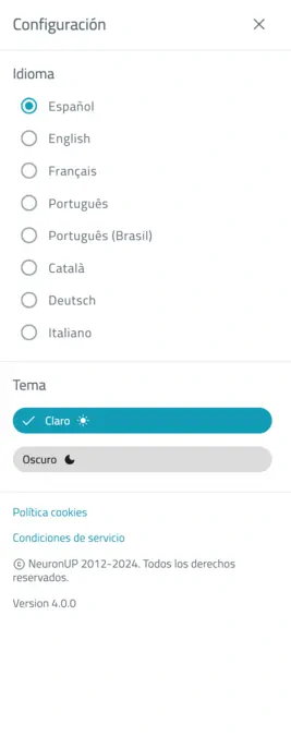
This new option will be accessible from the settings area, located in the upper right of the screen.
In the dropdown you can find the language and theme selection, being able to choose between the traditionally known light theme or the new dark theme.
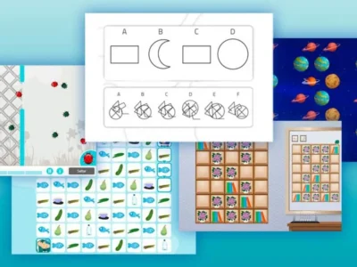
Improvements in NeuronUP usability
Finally, we want to inform you that we have managed to improve the usability of our platform in the mobile environment.
Not only have we optimized the usability of our platform for users and professionals working from tablets, but we have also fully adapted it to be used smoothly from mobile devices.
Below we leave you two images of this interface for mobile environments:
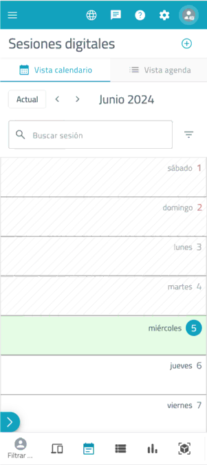
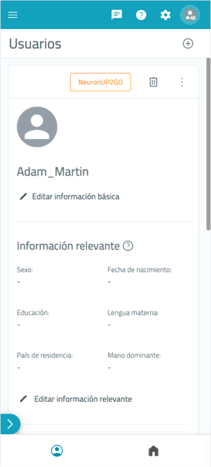
Images of the NeuronUP app interface on mobile devices.
Despite these new improvements, we still recommend working with NeuronUP on devices with a larger screen to enjoy the best experience with our activities and resources.
If you have any questions, do not hesitate to contact us via the email [email protected].


“This article has been translated. Link to the original article in Spanish:”
Continuamos mejorando NeuronUP
 Driving active aging: the Andalusian pilot of the PHArA-ON Project


Leave a Reply